
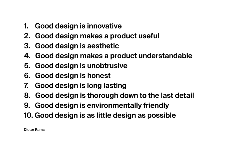
“Good design is as little design as possible.”
- Dieter Rams
This is the mindset I used to redesign my SaaS.
One year after the launch of Simple I decided it was time to improve the design. It was good before, but I wanted it to be extraordinary.
Why?
There is something special about well designed UI’s ✨
Version 1.0:
.png)
Version 2.0:
WHAT IS GOOD DESIGN?
Some might argue that good design is the same thing is aesthetic design. This is a very simplified view of design and is not true at all in my opinion. Yes, good design is aesthetic, but good design is also useful and understandable. This applies to all type of designing - apps, speakers, chairs, even a potato peeler.
Dieter Rams is one of the greatest designers in history which many companies, including Apple, has taken inspiration from. His 10 principles of design is a great guideline, regardless of what you design. It works on pretty much anything.
REDESIGNING SIMPLE
Now, let’s dive into the interesting stuff.
I had put a lot of time and effort in making my time tracker, Simple, as well-designed as possible. However, since its launch one year ago, there were some areas of the design that I thought could be greatly improved.
Simple 1.0:

Simple 2.0:
Even though both designs share many of the same elements, they differ quite a bit. One of the biggest changes in 2.0 is that it is more compressed - hence it has more features.
How? 🤔
The answer is the incredible power of Simplifying 🔥
COMPRESSING THE DESIGN
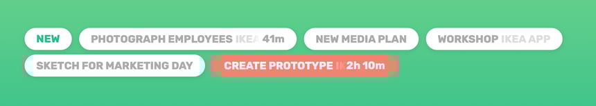
Categories and tasks looked too similar and were mixed up by many users. If you look at the screenshot below, both tasks and categories had the same shape:
The solution - combining categories and tasks:
Instead of seeing categories and tasks as two separate things, they were both combined. In addition to the benefits of users not mixing up categories with tasks anymore, a huge benefit with this design is that it is much more compressed.
“Compressed”?
Since categories and tasks was two separate things in 1.0 it took more space and you had to scroll to show everything. With the new solution Simple could show everything on a single screen, without scrolling 💫
SPEEDING UP THE DESIGN
Flow is a mental state in which a person is fully immersed in a feeling of focus, and a resulting transformation in one's sense of time.
With that said, users found it hard to differentiate tasks, which resulted in they not getting the flow in Simple that you usually get after using a product for some time.
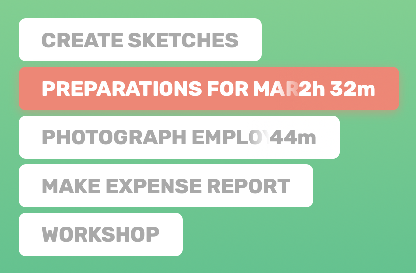
↑ The above structure was the problem. Try it for yourself, find the task “workshop”.
If this took more than one second for you, imagine having 4x more tasks (which is often the case). In todays society we don’t have the patience to look around a few seconds for the correct task, we want it to happen instantly.
But what could possibly be a solution to this? 🤔
I thought about this a lot. As with many design problems, the best solution is often to get back to basics. I challenged myself with the “Dieter Rams”-mindset, and came up with this simple solution:
Structure the tasks as a list ⚡️
There is one specific thing that is awesome with this structure: You can find tasks fast.
Why?
Now our brain can faster differentiate the tasks - based on it widths ↔️
SUMMARY
Good design is so much more than just good aesthetics. It’s tricky to produce, but when accomplished, it is beautiful in every way.
I hope that you learned something new to use on your next design.
Click here to view the finished product of Simple 2.0.
// Written by Rasmus Myhrberg, Founder of Simple